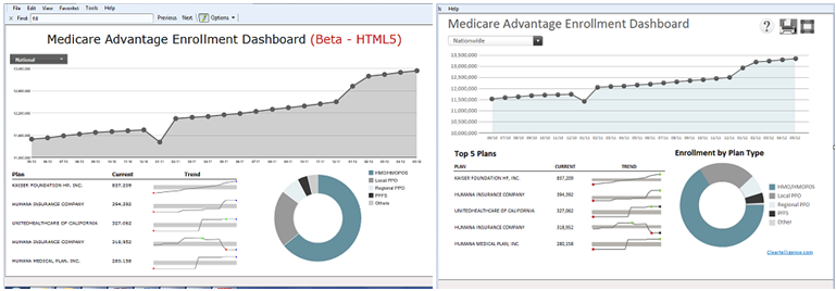
Please checkout the latest updates to our live html5 medicare dashboard: http://blog.cleartelligence.com/data/topchart.html
The latest version include sparklines and improved select menu UI… Compare the html5 version to the Xcelsius version (http://blog.cleartelligence.com/data/ma-enrollment-dashboard.html), and tell us what you think (of course, don’t try to do the comparison on an iPad, it’s not fair…)


The html5 version is definitely better. Well, in my opinion.
Thank you Paula, i certainly think it looks better then an empty screen on my iPad and iPhone .. 😉
I quite like the simple dashboard layout, particularly the use of sparklines. Also it works well in HTML5 (at least on Chrome). While I know that you were simply copying the original Xcelcius chart your chart could have further improved on original if the doughnut chart was replaced with bar chart because any variant of a pie chart has a high likelihood of being misinterpreted.
Thanks for the feedback Steve, you make a good point about the usage of the proper visualization here, the visual apeal may have won me over the functional…
Both look slick. But I think the HTML version will work on all platforms. Kudos.
Thanks Kalyan!