
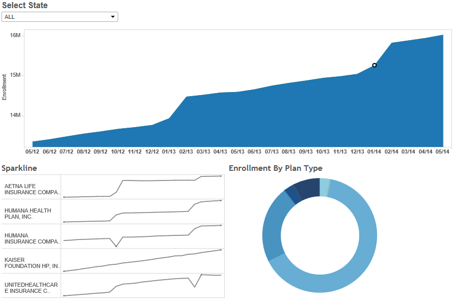
Our medicare enrollment database continues to grow and now contains over 9M enrollment records from across the country. I began collecting this information almost two years ago with my colleague Josh Tapley, and we used it to produce our medicare advantage dashboards using the SAP Dashboards (Xcelsius) tool, as well as our HTML5 reporting solution. Aside from being an interesting dataset, relevant to medical insurance professionals and anyone else interested in medicare and healthcare, this platform provides us the medium to demonstrate many technical advantages and techniques we often solve on projects. So, to add to our arsenal or medicare advantage dashboards, I have now added a Tableau version. This version looks and operates just like it’s siblings from SAP and our custom HTML solution, however uses completely different technology under the covers. To create it, we had to overcome several interesting challenges, from the ability to serve up Tableau content from our secure server which resides behind our firewall via secure proxy to the internet, addressing proxying, authentication and security challeneges to the ability to create visuals which do not exist natively in the tool, such as a donut chart. This dashboard is connected to the live data, and executed a query each time a state is selected. This design pattern is consistent across all three versions of this dashboard and is designed to demonstrate the ability to work with these dashboarding tools in a completely “hands free” no hassle, and no maintenance mode, where data is refreshed in the database and automatically reflected in the dashboard with no need for any intervention. Enjoy.