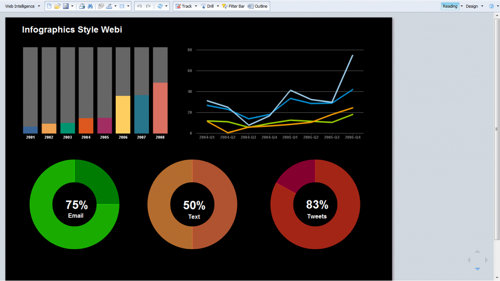
Web Intelligence reports are often thought of as boxy, ad-hoc’ish, somewhat sloppy collections of tables and charts. Of course, when creating quick ad-hoc analysis queries, that is completely appropriate, but when designing corporate reports for disseminating information in a way that will appear to the information consumers, webi provides all the tools of any top notch reporting application to create visually stunning presentation that can engage and tell a story.
To make this point, i looked at my colleague, Josh Tapley blog, data-ink, and found two of his stunning examples of reports and dashboard design. Josh used Xcelsius and our HTML5 dashboarding solution to create contemporary, info graphic style presentations. I used his design to produce a webi report that follows the same pattern, and i think the result can be quite compelling, certainly not your average webi report… Enjoy.
-
Archives
- October 2021
- June 2020
- June 2017
- March 2017
- September 2016
- June 2016
- February 2016
- November 2015
- July 2015
- May 2015
- March 2015
- January 2015
- September 2014
- August 2014
- July 2014
- June 2014
- March 2014
- February 2014
- January 2014
- December 2013
- October 2013
- August 2013
- July 2013
- June 2013
- April 2013
- March 2013
- February 2013
- December 2012
- November 2012
- October 2012
- September 2012
- August 2012
- July 2012
- June 2012
- May 2012
- April 2012
- March 2012
- February 2012
- January 2012
- December 2011
- November 2011
- October 2011
- September 2011
- August 2011
- July 2011
- June 2011
- May 2011
- April 2011
- March 2011
- February 2011
- January 2011
-
Meta


Very cool Ron. Thanks for sharing