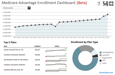
About a month ago, my colleague, Josh Tapley (http://data-ink.com/) and I set out to build an Xcelsius based BI application. Our goals were to demonstrate the capabilities of the technology, when combined with some fundamental data warehousing and BI techniques and great design principals.
We started our quest by looking for a large, publically available, dataset that will be interesting to analyze. We wanted to use a data set that can produce valuable insights by applying analytics and data visualization techniques to it. Josh suggested we use the government center for Medicare and Medicaid services which publishes monthly national Medicare enrollment numbers each month. The data is published as text and excel files and is proliferated across the site. It is a classical example of large amounts of data, published in raw format for users to wrestle with and with no information or insight in sight.
We proceeded to create a data repository (data warehouse of sorts), essentially coming up with a process for collecting the multitude of data files across the various sources it is published in, and loading the data into a database, using ETL techniques. The most granular fact table in our database of Medicare records contain 588846 records as of Feb 2012, it grows at a rate of approx 30-50K records a month. Not bad for a publically available data set.
We applied an aggregate strategy to our database to assure the queries we perform on it to support our application are adequately fast and users experience minimal delays as they navigate this rich data set.
With all the data on hand, we set out to design our application. We used simple, clean and intuitive design principals to highlight the analytics, and allow users to easily understand enrollment trends across several key factors. We wanted to tell a story, paint a picture, and not require users to struggle and stumble through complex interfaces and data layouts to get a gleam of information.
With our design at hand, we created a series of xml feeds that query the database on the fly and return result sets that meet our application layout needs.
The result is what we consider to be both a useful and informative analytical tools for anyone in the healthcare industry and beyond, as well as a good showcase of BI Happiness.. Please be sure to checkout our Medicare Advantage Enrollment Dashboard.
Enjoy!


Excellent work! Can you post the source files so we can see what is going on behind the scenes?
Thanks Steve, appreciate the feedback. I do post typically all source code and files, but in this case, we have a leave a little bit for the imagination.. Feel free to engage if you are looking for some specifics (ron.keler@cleartelligence.com). Also, be sure to checkout the html5 version: http://bihappyblog.com/2012/06/05/live-html5-medicare-dashboard-redux/
Amazing dashboard- great work! One of the best Xcelsius dashboards I have seen- polished and professionally designed.
Thanks Mariam, be sure to also checkout the html5 version: http://bihappyblog.com/2012/06/05/live-html5-medicare-dashboard-redux/
Ron, I really like the design of this dashboard. Is the combined Area/Line chart a standard component or is it an add-on?
Thanks
Dave
Thanks Dave, you can find out some more info on this in Josh Tapley blog, data-ink.
Hi Ron,
Nice work!
The full screen button is cool. How did you do that?
Thanks Terence, Josh posted about the full screen button here: http://myxcelsius.com/2011/04/19/add-a-fullscreen-toggle-to-a-dashboard-internet-explorer-only/
Thanks Ron and Josh, i like the fat that it is not crowded… I wish my users ask less 🙂
I meant fact and not fat 🙂
Thanks Santosh! 🙂
Super Slick!!!
Thanks Kalyan, much appreciated, especially coming from you! 😉
Ron,
nice work! have you thought about enabling users to identify top 5 plans by MA subtype (eg top 5 regional ppos, top 5 hmos, etc)? And what about a shareable version? (I know, I know, just what you needed – more work)
bookmarked, & looking forward to more
Thanks Greg! We are definitely looking for feedback, these are good ideas. We want to introduce more drill downs in terms of sub types and counties maybe. Not sure what you mean by a shareable version..? – Ron