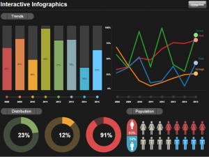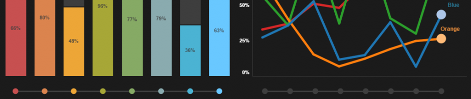
Ever since Josh Tapley published the infographic style dashboard, I have been working to reproduce this design in various tools. I used SAP webi and crystal reports to create similar versions in the past and recently produced another version in Tableau. This is an interactive dashboard, and clicking the Change Data button will refresh the dashboard with new random data. Click the image below for the interactive tableau workbook.
This is another example of why proper design in a dashboarding project is just as important (and in some cases more..) as data design. It is also an example that illustrates how Tableau visual capabilities can be stretched from a dashboarding perspective.. Enjoy!