Tough choices for BusinessObjects XIR2 clients

With SAP BusinessObjects 4.0 going GA, SAP will now have two full version number to support 3.x and 4. This spells the end of any support options for those who are still running BusinessObjects XI R2. XI R2 has been on extended maintenance since June 2010, so there are no surprises here, but still, the clients who are running on this version are feeling quite uncomfortable now that SAP will no longer “pick up the phone” if they call for help.
Those who are still running BusinessObjects XI R2 and are looking to get back to a supported version, face tough choices now: upgrade to the latest and greatest version 4.0, or upgrade to version 3.x (3.1 SP4 is the most recent release at the moment). Both choices have pros and cons, and IT and BI managers and professionals should think through these aspects before making the plunge either way.
BusinessObjects 4.0 has several exciting new functionalities and features. Significant improvement in the UI, 64bit support, multi-source universes and a new and improved Designer, strong mobility offerings and more. Not to mention, it is the most current version of the product and will remain in support a lot longer then 3.x. However, as we all well know, any major dot release of any big vendor software is bound to have bugs and suffer from issues. The 4.0 ramp up period offered many of us a glimpse into that with respect to this release. Stability issues on the UI, “spotty” performance and things that simply don’t work might be some of the issues some clients may experience at least until the first service pack is released, probably in six months of so. So those who are thinking about replacing a proven and tried platform that has been in operation for many years with a spanking new version must be comfortable with the fact that they may experience problems due to the “new” factor of any big enterprise system.
On the other hand, upgrading an enterprise platform such as BusinessObjects is not an easy or cheap undertaking. From an IT perspective, on top of standing up a new environment, most of the work will evolve around implementing new security models and upgrading reporting content. From the users and adoption perspective, there is a lot of work to train and educate a large global community about the new features and functionality of the new software. While an upgrade always provide new and exciting possibilities, it is not an easy task, and making a conscious decision to upgrade to a version that will be end of life sooner than 4.0  by a year or more is not easy either.
So, what should you do if you are still running on XI R2? First, consider your organization culture and users community. Will your users generally accept a few wrinkles in favor of new and exciting functionality, or will they reject a package that has any defects? Will your organization be able to “stomach” another upgrade to 4.0 a short year or so from now? What is the system usage like? How much reporting content is involved? Armed with the answers to these kinds of questions, a clearer answer will begin to emerge regarding which is the right option for your organization.
And of course, XI R2 clients can choose to remain on an un-supported (but working perfectly fine) platform, and wait for the first 4.0 service pack to upgrade…

Posted in Uncategorized | Tagged , | Comments Off on Tough choices for BusinessObjects XIR2 clients

Google swiffy can’t save Xcelsius… Yet

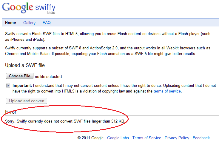
Last week Google introduced a new inovation from its labs factory called swiffy. Swiffy is a web based utility that can convert some flash .swf files into html5. Marcel Gordon, swiffy product manager, says about swiffy in this blog post “Swiffy uses a compact JSON representation of the animation, which is rendered using SVG and a bit of HTML5 and CSS3”. This is an exciting development for web developers at large, and Xcelsius dashboard designers in particular. Can you run your Xcelsius generated dashboard swf through swiffy and get a working html5 solution that will render on iOS? Well, unfortunately, not yet.. There are a few limitations that make swiffy not work with Xcelsius current version. First, swiffy currently only support swf files up to 512KB. An average Xcelsius dashboard is at least 1MB in size (in fact an empty 600*800 Xcelsius generated swf file would be close to 400KB, that is before you add a single value in the excel model or a single component to the canvas..).

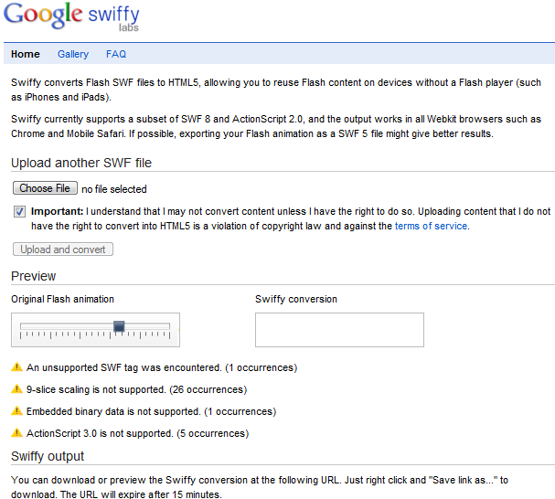
Also, swiffy currently only support Action Script 2.0. The latest version of Xcelsius uses Action Script 3.0. I also got a couple of other errors when trying to convert my Xcelsius generated file using swiffy. There is no support for 9-slice scaling and embedded binary data.

So, swiffy will not be able to save your next Xcelsius dashboard project when your users will ask about iOS support, but be sure to keep an eye on it, it might save the one after that..

Posted in Xcelsius | Tagged , , , , | 2 Comments

Migrating BusinessObjects Query as a Web Service

BusinessObjects Query as a Web Service started a few years ago as a lab project. It quickly gained traction and with the release of XI 3.x was integrated into the main product tree. This feature offers BusinessObjects metadata (universe) and reports designers the ability to publish reports as web services. If you are not familiar with it, the QaaWS interface is very intuitive and essentially is completely similar to that of a web intelligence report query panel. The difference is, when done designing the report, it is published as web service on the BO server, and provides you the WSDL URL automatically.
QaaWS have many uses for integrating data from your BO system into other applications, and BO itself uses this interface to transfer data to Xcelsius, since it already came with a web services data connection.
While creating a QaaWS is very simple, migrating them takes a couple of maneuvers that you should be aware of, to assure a successful deployment of your QaaWS data driven application from dev to test and prod.
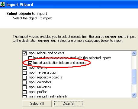
The basic migration is done using the BusinessObjects regular migration tool, the Import Wizard. Use the Import Wizard to select the option to migrate application objects and folders.

These would be your QaaWS objects on the BO system. With this option selected, the Import Wizard will direct you to select the appropriate QaaWS from the applications folder section of the repository, which is not visible in InfoView.
After you complete this portion of the migration, your QaaWS will essentially exist on the destination system, and will be in the same general state you would expect from any migrated BO object, with their CUID retained from the original system so that any links that exist between your QaaWS and other reports or application will continue to work as they did in the original system.
However, the web services URLs have not actually changed during the migration process, and will still be pointing to the original BO system. To reconfigure the recently migrated web services and assure they are pointing to the new target system, you will need to follow one more step.
Using the QaaWS designer application, login to the destination BO server, and open each and every migrated QaaWS. When you open a QaaWS that has a different server URL then the server name they are currently deployed on, the tool will prompt you to change the URL. Make sure you select the NO option to change the URL, and then continue to republish the web service.

Once you complete this step for your QaaWS queries, all your web services will be pointing to the correct system and ready to operate properly and as expected.

Posted in Universe Design, Web Intelligence, Xcelsius | Tagged , | 2 Comments

Can Cognos fraud detection software detect Cognos fraud?

I’ve been following the media coverage of the Cognos bribery case with the Massachusetts speaker of the house, Sal DiMasi, with great curiosity. Dimasi was recently convicted. But, what strike me as being very interesting is how IBM was able to completely avoid what I thought would become a public relations catastrophe. For whatever reasons, almost all the US media coverage of this fraud case focused on the rogue Massachusetts high officers clerks who agreed to award Cognos some $13M in software sales in favor of pocketing tens of thousands of dollars for themselves.

The coverage I followed was primarily on Boston National Public Radio station and the boston.com publication. Dimasi’s name has been all over the coverage, and the $25,000 he was given to award Cognos the contracts is mentioned again and again. However, all this was going down right around the time IBM bought Cognos. It’s quite obvious that a large state wide software deal worth over $13M in software sales alone would have been visible during the purchase of Cognos. How did this kickback scheme elude IBM execs when they were conducting their due-diligence before buying Cognos is not clear. It is also not clear how come the state of Massachusetts is still conducting business as usual with Cognos.

As a BI professional, who is passionate about providing information for individuals and business to help them improve their business and processes, I find it highly disturbing that a company that has such a message carved on its flag would be involved in such unethical and illegal practices. Perhaps this is a bit naïve, but I really thought that that type of corporate scandalous activity is reserved for high flying financial corporations, Enrons and such, and to be associated with an industry that employs these kind of practices is a very sobering fact.

Finally, you have to wonder if the prosecutors used Cognos fraud detection capabilities, as advertised by IBM here to find out about this…

Posted in BI At Large | Tagged , , , | Comments Off on Can Cognos fraud detection software detect Cognos fraud?

Mobile BI to replace reports push model

I first published this post on Technorati as Mobile BI to Replace Reports Push Model
BI Content is typically distributed in either a push model or a pull model. In a traditional pull model, content is generated on the BI server, and users are directed to some portal, where they have access to the content. They login (or SSO) into a website where they typically navigate to the location of a certain report they have access to.

This model got a lot of push back from managers and executives who are many times not very technologically savvy (this is something we’ll see gone over the next decade, as a new generation of executives who grew up with computers take on the economy), or don’t have the time to login to the internal portal to view reports. These executives like BI content to be pushed to them, typically via email. “I want you to email me the report automatically every day at 7:00AM, and I’ll look at it when I check email”.

The push model created a significant headache for the BI vendors who now had to integrate into their BI software packages scheduling, bursting and mass emailing capabilities, that are not really part of their core competency. For a while, the competition between the large BI vendors had a lot to do with this capability. Can OBIEE iBots accomplish the same level of bursting that SAP BusinessObjects Publisher can? Can interactive BI applications and dashboard created in the framework be packaged somehow into static emails?

Well, as the evolution of business continues to accelerate around mobility, the push model is evolving as well. Executives who had only email as a tool to consume information in a compact, rapid and mobile manner now have a lot more choices. Cell phone applications, tablets, net books and other technological gizmos now allow executives to stay connected with essential applications in a very streamlined and simple manner. Email is no longer the only option to receive information from the office. In fact, compared to the new BI applications that are rapidly becoming available on cell phone platforms, email seems, well, a bit arcane and cumbersome.

Certainly the investment already made by the BI vendors in their distribution technology will not be retracted, and these capabilities will continue to play an important role in operational BI applications and use cases. However, I expect we will see mobile BI applications address many of the uses business previously saw for report bursting and publishing technologies.

Posted in BI At Large | Tagged , , , , , | 2 Comments

BI applications – the evolution of dashboards and scorecards

There’s a lot of “chatter” about mobile BI, and BI in general these days. As the information age matures and explodes, BI is all the rage. Everybody seems to get the premise of delivering information, and the delivery medium that is becoming the standard is the dashboard. The BI vendors have done such a good job increasing the reliability, functionality, and simplicity of use of their BI dashboarding tools, while stretching their capabilities further and further, that the business has started taking notice.

The level of sophistication users now expect to see in their BI solutions is far beyond that of simple reports. They expect interactivity, navigation, drill downs, up and sideways, and a cohesive user experience, the same they would see on a commercial website, or an application. And yet, many continue to describe the BI products as “reports” or “dashboards”. Well, that perceptions can be very misleading as the level of design and effort required to produce this new breed of data driven applications is misunderstood.

Traditional BI projects require a combination of skills that must be carefully combined to achieve success. Strong business sense and understanding of functional requirements, strategic goals and organizational structure must be combined with strong data skills around dimensional modeling, etl techniques and a wide variety of technologies that are used in BI projects. Now add to this long list traditional application design skills.

Today’s “dashboards” are made out of at least 5-6 screens, and on many occasions exceed 20, with complex and highly refined navigation paths, use cases, functionality to hide and show various parts of the application, with different levels of data granularity and presentation and different times based on user interactivity, maintaining drilling contexts across all this, complex security requirements and of course must be graphically stunning. Similar traditional applications written in programming languages such as C, Java or .net can take many months and a team of developers to complete, but “dashboards” roll out on schedules measured in weeks.

Furthermore, as excited business users start using these BI applications, they quickly realize the potential of commercializing them and unleashing them on their own external clients.

This is most certainly the evolution of BI. These new applications are delivered over traditional PCs, mobile devices, on intranets as well as the internet and are being designed to cater to a wide variety of users, from novice technically challenged users, to the savviest business analysts.

The BI applications trend is on a trajectory headed for wide adoption. As more companies learn about the new capabilities of the leading BI tools from SAP, Oracle, IBM, Microsoft and the likes, and data visualization technology continues to improve, I expect to see these applications become the norm in any BI project, taking the place of the more simplistic dashboard or scorecard.

And as this happens, we will surely see more traditional software design methodologies make their way into the BI world.

Posted in BI At Large | Tagged , , , , | Comments Off on BI applications – the evolution of dashboards and scorecards

Open source BI with Pentaho – how far can it stretch?

Open source BI software is a fascinating topic that deserves a lot more discussion. Since the domain of business intelligence is all about information democracy and “liberating” the data that is locked in the company databases, turning it to meaningful insight, I would argue that the software used to perform this work is still not the key ingredient to achieve BI happiness. Of course, the tools are important, and every BI implementation must include a proper tool selection process in which requirements are aligned with capabilities, as well as price. But as long as the software selected is reasonably adequate to the BI implementation needs, the success becomes all about the implementation and the adoption of the new tools, being deployed to provide transparency and disseminate information throughout the organization. From that perspective, as long as the open source software meets the grade, it makes perfect sense. In fact, since any BI implementation will require a good degree of implementation services, getting the software for free makes a lot of sense. BUT (in all caps), can you find an open source BI platform that meets your needs and follows standard BI architecture? Pentaho could be a good answer to this question.

I remember reviewing Pentaho several years ago. At the time, the technical folks there were doing some pretty impressive things, like integrating Google maps in dashboards. Shortly after I saw that example on the Pentaho web site, I remember seeing the BusinessObjects mashup concept start coming to life, with maps and other web content integrated in webi reports. Coincidence? Maybe.

Today, Pentaho is available as an enterprise grade commercial product and an open source product. The open source “community edition” is targeted for non-enterprise users: college students, developers, small local implementations. But how far can you take the community edition? I will try to find out.

First of all, the breadth of products engulfed under the Pentaho umbrella is impressive. They got much of the BI architecture cornerstone covered. The BI server provides web based centralized access, control, content management, scheduling and security. A metadata management tool allows the creation of reusable data sources for business users. The report designer and analysis view provide good drag and drop type ad-hoc web based functionality. Kettle is a robust ETL tool included in the framework, and Mondrian is Pentaho’s own OLAP engine for cube analysis. The ChartBeans look promising and seem to provide the type of data visualization capability we see from Google and others these days.

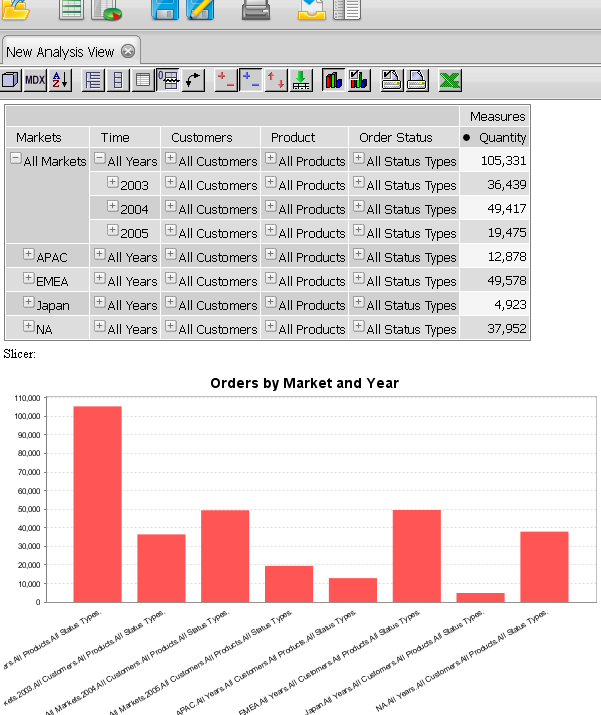
I was also impressed with how simple it was to get a simple Pentaho installation going and produce a first “Hello world” report (screenshot below). In a couple of hours or so I had the software downloaded, running and the first report created. Quite painless.

Like any software product, I am sure Pentaho has its strengths and weaknesses, and I will describe some of them over the next weeks as I dig deeper into the platform.

Posted in Open source BI | Tagged , , , , , | 3 Comments

Xcelsius flyout menu

One of the most important aspects of dashboard design is navigation. Just like any other application, a dashboard is made out of content, functionality and navigation. The drilling, slicing, dicing, and data exploration are all part of your BI application navigation flow, and you must consider it as part of your designs if you wish to be successful. I explored navigation in other posts as well, such as this one. Since Xcelsius deploys like a website (.swf) and “feels” like a web site, users often expect web site functionality out of it, like fly out menus. I took a stab at building an Xcelsius flyout menu. You can find the xlf here. The mouse over functionality in Xcelsius is descent, but I’m not sure it can really compete with javascript, dhtml, ajax, etc. Also, the lack of true event driven programming makes it difficult to “program” navigation. But in any case, this is a pretty good start for your flyout Xcelsius menu..

Posted in Xcelsius | Tagged , , , | 5 Comments

Ad-hoc reporting – a reality or a myth?

The light dims. The large screen in front of you is filled with menus filled with familiar data points, organized and neatly categorized. Here’s your geographical hierarchy. And there are your financial measurements, and over there, date perspectives from the regular calendar and your fiscal one.

The cursor moves effortlessly across the screen, and the smiling sales engineer flicks finger, truns a nob here, drag a box there, creating within seconds a report, just like the one your boss was asking you for two days ago. Here it is, constructed in front of your eyes with stunning graphs, charts and tables, drill downs, filters and all, by a single guy and within minutes. And here you are, two days after your boss requested the report, still trying to negotiate an IT resource who can work on this , maybe next month.

Behold the power of ad-hoc reporting. Information for the masses. Democratization and transparency for data. Nirvana. Or is this too good to be true?

The ad-hoc reporting hype reminds me sometimes of the paperless office hype. Computer and electronic documents will replace the need to use paper in the office. It sounds logical, and it kind of makes sense, but things really don’t work this way in the real world.

Ad-hoc reporting is certainly a powerful concept, but it can get over hyped sometimes. When people who are not data experts demand access to create their own reports, they usually overlook the complexities of the data. Many of them are not aware of these, and the few analysts, who are deep into the systems and the data, still tend to over simplify things.

In a typical department, there will be maybe 1% of the personal who will be able to actually leverage ad-hoc reporting capabilities. It takes deep knowledge and understanding of the domain and the data, something that typically only very few analysts would have, and a strong technical sense. Not only the data is hard, the tools are as well. While they demo well, and seem completely intuitive when used by a pro who have been using them for years, for a novice user, who may not be the most technically savvy, it can take many months of frustrating experiments before they can actually produce meaningful and sophisticated insights.

So, is ad-hoc reporting a reality or a myth? The tough answer is it can be both, and that depends on your organization, goals and needs. If you work in a low-tech company, where your core business operations do not require people to use sophisticated software, and you expect the masses to start creating their own reports to improve business procedures, you will most likely fail. You will be much better served with a custom build information portal, a BI embedded application or an intuitive dashboard that will appeal to your users, attract them to consume information, and spoon feed them with what they need to know. However, if you have a strong group of capable analysts who understand the systems and the data they generate, and are comfortable with operating complex software, they would probably good candidates for developing their own reports, with little or no IT intervention.

Posted in BI At Large | Tagged , , | Comments Off on Ad-hoc reporting – a reality or a myth?

Time lapse or high speed your business processes with history preservation techniques

High speed and time lapse photography are two techniques that allow us to understand the world around us by slowing down or speeding up processes that we could otherwise not be able to observe. High speed photography allows us to record phenomena that occur within a blink of an eye, and then replay them, frame by frame, millisecond by millisecond, to understand in full what has happened.

Time lapse photography allows us to capture processes that take a very long time, and play them much faster, which again allows us to develop new ways of understanding what has happened.

Both time lapse and high speed photography are ways to observe historical changes, at various speeds, using different filters to develop new perspectives regarding the subjects photographed.

That is, in essence, one of the most important premises of the data warehouse. History preservation techniques allow the business to play back events, slow down fast moving procedures and examine individual transactions that contributed to big maneuvers, or play back events that happened in the past to analyze and gain insight into their efficiency.

History preservation in the data warehouse is accomplished through different techniques, primarily known as slowly changing dimensions and snapshots. There are tons of literature materials out there about both, and if you are not familiar with those, and are working anywhere near data, you need to very quickly become familiar with those.

As a matter of practical example, take your sales forecasting information. You must have wondered about: how good are your forecasts? How accurate are they? Can you rely on your sales team forecasts regarding next week, next month, next quarter or beyond?

The only way to answer this question is to observe the forecasts accuracy over time. The forecast changes every day, and as opportunities get closer to closure, the accuracy improves. But since the forecast updates constantly, how can you tell if the predictions made a month ago about the following month were accurate or not? Well, your data warehouse could provide you with exactly this capability and allow you to examine your forecast as it gets updated each day, comparing it to the actual bookings as they occurred. Armed with such powerful information, you can develop a strong sense of your forecasting accuracy over time and across time.

Just like time-lapse photography, it takes time to build up the necessary amount of frames, or snapshots, to allow you to slow down reality and analyze what happened, but the results can provide you with course changing insights into your processes to help you achieve your goals and improve your competitive edge.

Posted in BI At Large, Data Warehousing | Tagged , , , , , , , | Comments Off on Time lapse or high speed your business processes with history preservation techniques