Dynamic visibility in webi

One of the features that webi was lacking for years was the ability to conditionally suppress columns. Especially when compared to Crystal that supported this kind of functionality from the get go, or Xcelsius with its dynamic visibility, webi report designers needing to show or hide columns in tables based on certain conditions were left to use cheesy tricks like setting the column width to 4px (historically, the minimum column width in webi) with white font and white background alert rules. This technique worked “O K” online, but exporting reports to excel revealed the “hidden” data columns and the extra padding could cause some formatting issues.
Well, webi in BO 4.0 has made a big step forward to resolve this issue. Now, any report element can be conditionally set to hide based on a formula, allowing report developers to create different tables for different scenarios.

Consider this simple example, using the e-Fashion universe:
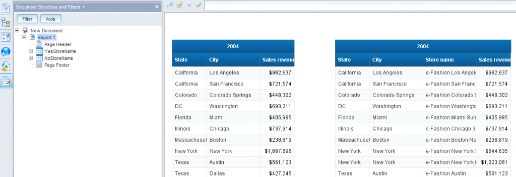
Your reporting requirement is to present e-Fashion stores revenues by State and City, prompting users for a reporting Year. Moreover, in 2004, there were less stores and management wants to break down sales by stores, but only in 2004.
You can start by setting up your query with the needed objects: State, City, Store Name, Sales Revenue and Year. You can make Year a prompt.
Now, you can create two blocks in webi: one with the store name, and one without.

Next, use good old relative positioning to align them along the top right corner of each other.

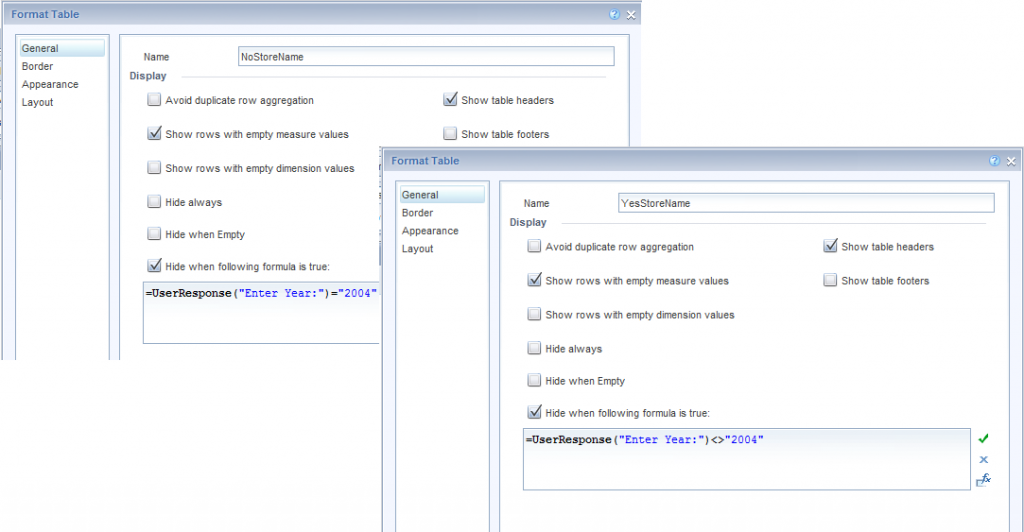
Finally, go to each report block format options, and specify the appropriate formula to determine when to display or hide it.

And Voila! When users select 2004 as the prompt value, they will get the store names column, for other years it will disappear.

Posted in Web Intelligence | Tagged , , | 16 Comments

Making sense of Crystal Reports SDK and APIs

If you are looking to integrate Crystal Reports into your application, you have many ways to go about it. You can find oodles of information about the different options, pros, cons, differences and user guides, tips and tricks galore in the product documentation and over the web. The purpose of this post is to cover some high level differences between some major choices, and explain in simple terms some key factors that I believe will play into your decision into which integration option to use.
First, you will need to take your pick of technology: .net or java. For most people this would be a no brainer since most developers are predisposed to one vs the other. Since my disposition is toward Java, I will cover the choices related to it, although the .net options are pretty much the same, there is an equivalent SDK/API in .net for every java options mentioned here (religious arguments aside…). You will face three major choices on how to integrate Crystal:
– Using openDocument API
– Using the Viewers Java SDK (which in itself contains several choices) or
– Using the RAS (Report Application Server) Java SDK (of course this branches as well)
Here are some high level descriptions of each of those options with some key considerations:
The openDocument API is the simplest and most common way to integrated pretty much any BusinessObjects content into an external web based application. It provides a variety of url query strings that can be used to call content from the BO repository, from webi, to crystal, dashboards and more. This API is simple to use, quick to integrate and develop with, and provide good level of customization and flexibility through the variety of parameters that can be processed over the URL. It requires no programming knowledge, and anyone with basic understanding of web technology can learn how to use it (the only caveat to that can be authentication). However, it does have limitations in terms of ability to customize and control presentation and behavior of the integrated content. For example, using the openDocument API, you will have very limited, or no control, over the many Crystal viewers choices you might want to control, such as control of prompts screens, group tree, or toolbars. You will also be passing all the information you will be feeding into the report (including a session token used for authentication) over the URL, in plain sight, which may pose a security problem for some applications.
So, if you are looking for better control of the viewer, and tighter security control, you might be looking at the viewers SDK next. The Viewers SDK does require some java programming knowledge, and in return provides much more flexibility and control over the report presentation and integration. It provides several implementation, including tag libs and JSF options, so can cater to several flavors. Using the viewers SDK developers can control report dimensions, display different tool bar options, and choose how to present and embed Crystal Reports in their web applications. It is a rich SDK, and can address most presentation needs. However, it too has some limitations in terms of the ability to manipulate more of the “guts” of the Crystal .rpt file. Enter the RAS SDK.
The RAS SDK is the richest and most complex Crystal java SDK, and provides the most flexibility, control and security. For example, using the viewers SDK, you may pass parameter values to the report object, but these would be passed through the viewer itself, making them visible to the client. While using the RAS SDK you can modify the report selection criteria on the fly, on the server side, before the viewer is even initiated and without passing to the client any parameter info. Of course, all this power means more complexity and more code that can be written to accomplish more sophisticated reporting use cases and integration scenarios.
So, which integration option is right for you? Consider your reporting use cases, the level of sophistication you require in your integration and your security requirements to determine if openDoc will suffice, viewer SDK will be needed for tighter integration, or full control is what you need, using the RAS SDK.

Posted in Crystal Reports | Tagged , , | 1 Comment

An Elegant Solution to a BI Problem

My wife thought it was strange that I got excited when I looked at the cash register receipt as we left the shoe store. Usually a receipt is the beginning of a discussion about why we spent more than we planned, but in this case it was different.

“Look,” I said, “This is neat. A portion of the $10 coupon that we used has been assigned to each of the two pairs of shoes.”

“Why is that neat?” she asked.

Taking the rare opportunity brought about by her interest in my fixation with data, I continued to explain that one of the challenges in BI was allocating costs down to the lowest level. People want to see margin at the product level, but that can be hard to calculate when costs (or discounts) are assigned at a higher level. Often, it is tough to pin down the business rules needed to do the allocation.

This shoe store chain solved the problem. The business rule was determined and applied right at the point of sale. Any downstream system, including a data warehouse, would have this information. Problem solved.

I had a good afternoon. Two new pairs of shoes and a little BI happiness to go along.

Posted in BI At Large | Comments Off on An Elegant Solution to a BI Problem

Extend SAP Dashboard visualizations and capabilities with google charts integration

Back in January, i wrote about Google Charts, and how they stand to shake the BI and data visualization world. Well, over the past months, not only the charts collection has grown substantially and now includes many nontraditional charting options, like maps, and dynamic icons, google gwt now includes a data visualization library that can produce quite stunning results. But even with no programming skills, google charts url api continue to provide any web developers with a simple way to mashup and extend their application by integrating interesting chart images. SAP Dashboards (Xcelsius) can certainly benefit from this as well. Using the Slideshow component, which can render images located on the web, you can add new kinds of charts, dynamic icons, and even data driven maps to your dashboard. In this example, you can see maps, box charts, venn charts and QR codes generated via google charts and integrated via the slideshow component into an Xcelsius dashboard. Of course, any web based reporting tool, webi or crystal included, as well as obiee and many others, can benefit from this technique. You can find the xlf for this example here. If you found an interesting way to use google charts in your BI or data visualization project, please feel free to share.

Posted in Uncategorized, Xcelsius | Tagged , , , , , | Comments Off on Extend SAP Dashboard visualizations and capabilities with google charts integration

Would you pick strong planning or strong execution for your BI project?

If you had to choose, would you pick strong planning or strong execution for your BI project?

Any project can be thought of along the lines of planning and execution. BI projects are of course no exception. Some projects emphasize one over the other, some look to strike a balance. Individuals working on the projects typically tend to be stronger on one or the other: some are great at planning, strategizing, architecting and gathering requirements, while others are great at building, prototyping, developing and executing. The nature of the projects matters as well. So, when you consider a BI project, would you emphasize the planning activities or try to focus on execution?
BI projects are typically more of an explorative journey than a plotted trip from point a to point b. They are riddled with unknowns and questions. Very often, it’s not clear what kind of information will be unlocked by organizing data. It’s also typically not clear what would be the best way to display the data to derive the most useful information. This typically leads to unknowns around the data organization. There are numerous technological, procedural, organizational and political hurdles to overcome. Defining business terms and then translating those definitions into the enormous amounts of  rows and columns that are spread across many databases is not only technically challenging, it requires constant dialogue between the people who are working with the technical details, and those who are working with the abstraction layers of information.
This unique nature of BI projects, constantly swinging between technology and business is why i would pick execution over planning if presented with the choice above. Strong execution means agility, attention to detail and pragmatic approach to solving ever changing challenges. Naturally, execution has to follow an underlining plan, or architecture, otherwise you will end up with a messy mash of components that cannot scale or work in concert, but as long as there is a reasonable amount of planning, focusing on strong execution in your BI project is what will bring you success.

Posted in BI At Large | 1 Comment

Centigon GMaps Plugin example – MA counties, towns and traffic stats

Maps are a very powerful way to visualize data and bring information to users in an attractive and usable manner. Maps help make data intuitive and fun and encourage usage of information. Xcelsius comes equipped with a variety of out-of-the-box maps that work well for certain use cases. If your geo data is fairly static, and is organized along the lines supplied in one of those maps, they work well. However, more often than not, your Geo data is sporadic, dynamic and messy in geo-political terms. If that is the case, or if you are looking for a powerful and dynamic mapping data visualization, look no further then Centigon’s Gmap plugin for Xcelsius (SAP Dashboard). I can write about how simple and intuitive it is to use, about how it seems to include anything you ever wanted to do with a map in Xcelsius, or about how fun and exciting users find it to be. But rather than that, i decided to build this example. I found some information about counties and towns in MA, along with some traffic data. Then, i staged the data in an Xcelsius model to produce this visualization. You can pick any country in MA, and the map will plot the towns in that county. The green icons include traffic data when you click on them, the blue ones, do not. The chart at the bottom provides county demographic data. You can find the xlf here. Enjoy.

Posted in Xcelsius | Tagged , | Comments Off on Centigon GMaps Plugin example – MA counties, towns and traffic stats

Shana Tova

Today is the first day of the Jewish Year 5772 (תשע״ב). Last night, we celebrated Rosh Hashana, the Jewish New year. The Jewish calendar is lunar based, not solar based, which is why it is not “aligned” with the civil, or Gregorian calendar used by most of the world (including, by the way, Israel). If you like to learn more about it, this is an excellent resource about the Jewish calendar: http://www.jewfaq.org/calendar.htm
So, to help keep track of it, i created this Xceslius based date convertor (xlf is here). Click on a date in the calendar, and you will get the Jewish Hebrew date for that date.

Shana Tova to everyone, may this be a year of health, prosperity and peace for all!

Posted in BI At Large, Xcelsius | Tagged , | Comments Off on Shana Tova

Magic Quadrant bubble chart in BI 4.0 Webi

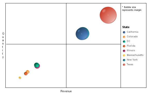
SAP made some significant improvements in the Web Intelligence reporting tool with the release of the latest version of their BI stack, 4.0. One of the improvements is the addition of several new chart types, and overall improvements in the charts data visualization quality. As an example, i tried to use the new webi bubble chart and was pleased to be able to produce a good presentation of one of my favorite charts/visualizations:  a magic quadrant. The magic quadrant was made famous by Gartner who typically plots various vendors across four quadrants representing the marketplace. This is a very effective way to visualize and quickly understand the relative position of different entities in a complex environment. To improve on this visualization, the bubble chart also allows you to use the bubble size to represent an additional piece of information, so that even within each quadrant you can further grasp very quickly and effectively the position of entities in relation to each other. It’s a great way to represent many business domains, such as sales pipeline, financial information or HR data. In this example, i used the e-Fashion sample database to plot revenues, quantities and margins for states. You can find the .wid file here.

Posted in Web Intelligence | Tagged , , , | 2 Comments

Navigation and context in your BI implementation

I wrote about the importance of navigation in any BI application, whether it is a report or a complex dashboard, in various prior posts. Recently, i realized that discussing navigation without mention of context is incomplete. When talking about context in the context (no pun intended) of a BI application, we typically refer to a drill point.
In a classic application, navigation is concerned mostly with pagination and directional orientation. However, almost any BI application also includes drilling capabilities. These are essentially filters that “pan” the user perspective around certain attributes. For example, a drop down box can be used to present a list of business unites, and when a user selects a particular business unit, the data in the dashboard filters to reflect only data relevant to this business unit. In essence, this drilling is also a type of navigation. To make sure your users are not getting “lost” and confused, you should consider both the classic pagination navigation, how to get from one screen to another, but also the contextual navigation, or drilling, and how it affects, or play off and in tandem with the rest of your application navigation scheme.
As is the case in any application, the key point is being thoughtful and thorough, and building to spec, rather than having a one size fits all design answer. With that said, while in most cases you will find that maintaining your user contextual choices is desirable while navigation across pages, that may not always be the case. In particular when you consider bi-directional navigation. As users move “back” to prior screens for example, should you keep newer contextual choices they made on forward screens, or revert back to the context that was applied on a page when they left it?
And one last thought on this topic: as always, the key consideration should be the user’s needs and requirements, and not some tool or technology capability. If you are designing a BI application with a tool that does not allow you a good level of flexibility around navigation and context, you should probably be looking for a different tool.

Posted in BI At Large | Comments Off on Navigation and context in your BI implementation

Charting the future of gambling in Massachusetts

As someone who lives in Massachusetts, near Boston, i had mixed feelings today about the House approval for casino gambling. On the one hand, i am certainly hopeful about the introduction of a new industry into the area. The expected boom in new jobs and economic benefits that are expected from the construction of the new “resort style casinos” are exciting in did. I have no doubt that the amount of business opportunities that will follow this move would be dramatic, and will help the region financially. However, i am also leery and concerned by some of the social possibilities that might accompany these resorts. Will we also see a dramatic increase in crime and prostitution, “Las Vegas style”? No one really knows if we will see the expected benefits or downfalls of this move, and all i can do is hope for the best. For now, all i can do is express the uncertainty with the visualization below that uses randomized series to chart the financial benefits and social drawbacks of opening casinos in Mass. I hope your charts come up favorable.. (oh, and of course you can download the xlf here)

Posted in BI At Large, Xcelsius | Tagged , , | Comments Off on Charting the future of gambling in Massachusetts