Leveraging dbt to manage modularized sql for analytics is a game changer and an important pillar of the modern data stack. But not only the ability to re-use sql components on your cloud data warehouse, clearly understand data lineage and relationship with the visual DAG feature, build trusted data assets with re-usable sql tests scripts and centralize the ELT documentation make dbt such a delight for data engineers, the integration of jinja templates and the ability to apply them through macros throughout your dbt project can become incredibly powerful when it comes to flexibility and re-use.
Case in point: imagine you are working on an analytics project that includes analyzing time series data. Let’s say your initial assumption, after speaking with the key business stake holders, are that the time window needed for the analysis is 8 weeks. 8 weeks, you are told, is a magical amount of time, and anything that happens within an 8 weeks’ time window is paramount to our understanding of the business problem at stake.
Armed with this knowledge, you set out to build a series of interesting and complex dbt models that all rely on this 8-week period. Some models might require an application of a where clause that measures 8 weeks, others might apply window functions that use sliding windows for more complex aggregation.
For example, you may end up with some intermediate, or reporting model that looks like this:
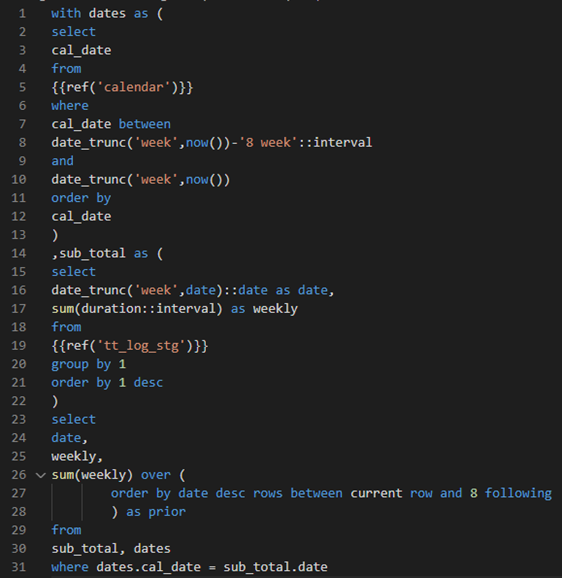
Of course, this is just an example used to illustrate a concept. The 8 weeks timeframe is referenced in this model in two places, once as an interval for a between where clause, and once as the upper bound of a window function. While we can use a database reference for a between function in sql (between table_a.column_a and table_a.column_b), the window function syntax is more restrictive and can only be referenced as a constant.
In the real world you would have many sources and many models with many references to the magical 8 weeks periods. Perhaps over time, you find that you end up with dozens of models referencing this key assumption…
Well, fast forward a week or two, you now have the results of the model neatly compiled into a consumable product, perhaps a beautiful Tableau dashboard, or a basic excel data dump, and you proudly show the results to the project business stake holder.
Your stake holder sees the results and after a quick consideration informs you that the numbers look off and the time comparison period should be 9 weeks…
Sigh…
Now you have all these “8 week” references to replace in many models. Assuming you are using VS Code for your dbt project, you can use the Find and Replace functions to search across all your models and tests, but this is an error prone, time consuming, and frustrating process… And there’s no guarantee that the time window won’t need to be changed back to 8 weeks next time the stake holder reviews the results..
How can you centralize this key assumption so it can be used across all your model and test files in your dbt project, without needing to hard code in everywhere?
If you create a database object, perhaps a CTE in this fashion
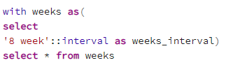
You will be able to reference it in some places and leverage it in some parts of the model, but not everywhere. For example, in the “rows between current row and n following” sql snippet where the number n is a static constant that cannot be provided to a select statement from a column name in a database object (at least in Postgres). What to do…? Well, that’s where dbt macros come to the rescue!
dbt comes with some critically important macros, which are basically jinja macros. Jinja is a great templating engine and integrating it with dbt is what allows the ref and source macros for example to be used to generalize sql code and create reusable components.
And, lucky for us all, we get to define our own jinja template macros and re-use them in our sql models! So, solving our 8 weeks model assumption centralization problem is as simple as a single line of code in the dbt macros folder:

So now, you can reference the model_weeks() macro function in your sql models, and replace all the hard coded references to 8 with this macro. The macro can be injected anywhere in your sql files, dbt will first compile the sql files to be run on the database, replacing any jinja template macros with the appropriate text, and then execute them in the DB, so the macro can be used anywhere needed in the sql code, as variable, constant, clause statement, anything!
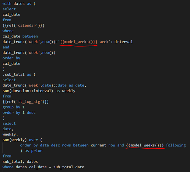
In the following image, note what the model above looks like with the macro references instead of the hard coded numbers. Note how the macro is used both within a single quote or in a window function, with no issues. The macro will simply be replaced with the number of weeks and then the compiled .sql file will be executed!
This is of course a fairly simple example, you can leverage your macros in many ways to centralize logic, increase reusability and make your models more agile, accurate and adaptive to the rapidly changing business needs!
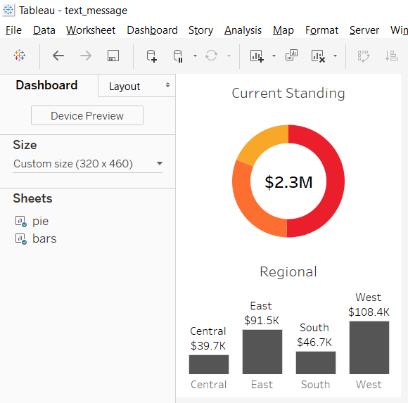
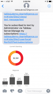
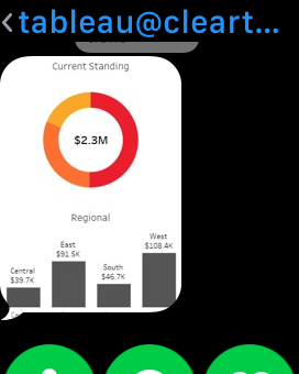
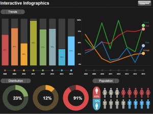
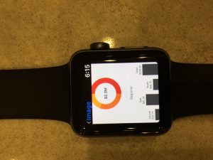 The addition of conditional subscriptions in Tableau server version 10.1 opened up the door for easily operationalizing alerts with Tableau dashboards. Not only it is easy to create conditional subscriptions that can automate operational information related tasks, these alerts can be distributed not only via email, but also via SMS or MMS messages. This means that critical, real time information about any data condition can be delivered in a manner that can be consumed by new (and old..) kind of devices for even better visibility and effectiveness. For my example, I first created a basic simple dashboard that is suitable for a phone, or even a smart watch.