Group by on the fly

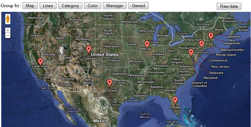
One of the great features about the google visualization api we use in our html5 dashboards, is the ability to perform client side, run time group by operations. Unlike Xcelsius, which does not provide this functionality, this ability allows us to get all the data we need in one trip to the server, and then using group by aggregate the detailed data in different levels for different presentation needs. In the example below, i got some sample data (from eFashion…) and am using different group by options to aggregate the measurements, revenue and margin, by different dimensions in the dataset. All the data is retrieved from the database once, when the page loads, and the rest of the magic happens in the browser memory, no server calls involved. This example also includes the ability to toggle the chart presentation with a map, and the ability to view the full data set (all 4715 rows of it). Enjoy.

Posted in HTML5 | Tagged , , | 2 Comments

Integrate real time stock info using Crystal Reports

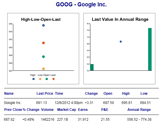
Crystal Reports was created almost two decades ago. In Software age terms, it’s a dinosaur. There are certainly sexier, slicker and faster tools to develop with, in the BI space today. But when it comes to integration, crystal reports is still the king. The reason why everyone heard of crystal, and any company still has a crystal reports being used somewhere, is its extensive SDK and robustness. The huge users base and long history of usage means that anything you are trying to do with Crystal was already done before, and you will find information on the reporting use case you are trying to accomplish with Crystal somewhere on the web. As an example, i posted this crystal report that leverages the RAS SDK to display stock info based on a user selected ticker. The report consumes a WSDL web service (from www.webservicex.net) as its data source, and parses out the response to display the stock info. The crystal viewer has been modified in this example using the SDK, as well as by modifying the viewer skin to accomplish smoother seamless integration into a white background web page.

Posted in Crystal Reports | Tagged , , , , | Comments Off on Integrate real time stock info using Crystal Reports

Get Xcelsius EIC connection to work properly in IE9

The EIC (External Interface Connection), is a key feature of Xcelsius that allows the creation of sophisticated integrated dashboard. It’s a programmatic way to pass information through javascript to and from the html container that embeds the Xcelsius swf object. If you never used it, be sure to check off this capability and at least understand it, so you can have a fuller picture of the product.
Xcelsius ships with some EIC connectivity samples that are used throughout as the base for implementation in projects. These samples represent best practice, and i typically start my coding with them. Well, recently, i ran into problems with teh EIC connectivity, especially with modern browsers, and particularly with IE9. With the invaluable help of my colleague Robert Blackburn (whose outstanding blog, http://rwblackburn.com/ is a tremendous resource) , we were able to narrow down the EIC connectivity issues to the javascript function used to call the swf object in the EIC samples, get Movie(). The getMovie() function is used in the EIC sample code as a utility function to obtain a reference to the swf object that you are working with. However, this function was written some years ago, and some of the js and html standards that existed at the time it was written have changed, in particular, IE9 is breaking some new grounds with its support (or non support) for functionality that is widely used and accepted in other browsers, such as firefox or chrome. In any case, we were able to identify the root cause for the EIC failures in the getMovie function and fix it. So, if you are having any problems with EIC values not working properly in IE, simply replace the getMovie() function with the one below:
function getMovie(movieName) {
var movie = undefined;
if (navigator.appName.indexOf(“Microsoft”) != -1) {
movie = document.getElementById(movieName);
} else {
movie = document[movieName];
}
return movie;
}

Posted in Xcelsius | Tagged | 7 Comments

Visualization for Unstructured Data

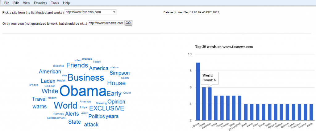
One of the most interesting data visualization and BI concepts these days is unstructured data analysis. To demonstrate one use case for visualization analysis of un-structured data, and digesting large amounts of information into a more palatable dish, i created the following website word analyzer. The idea started with analyzing news web sites, but this can certainly be used more generally. In this example, a website address is being scraped using a server side (php) program, all the words on the webpage selected are counted, and then loaded into a tag cloud and a column chart based on the number of occurrences on the page. Please checkout the example for some more info on how it works. I found it to be very interesting… Enjoy!

Posted in Data visualization, HTML5 | Tagged , , | 1 Comment

BusinessObjects 4.0 Oracle Audit Universe woes

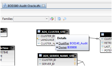
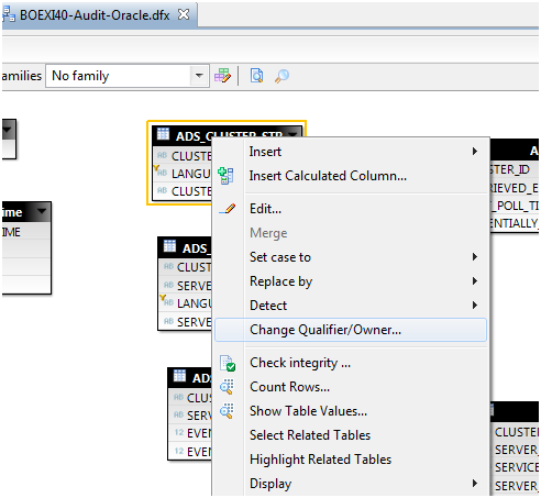
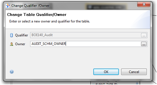
In BI 4.0, the Activity Universe, which was used for years as the source for auditing users and system activities in business objects, was discontinued. And while initially 4.0 shipped with no auditing reporting solution, SAP developers stepped up and produced auditing universe for several platforms (audit databases). While their efforts are much appreciated, trying to use the audit universe against an oracle database proved to be not as trivial as the four lines of instructions provided with the sample. In particular, it looks like changing the connection from the sample connection provided in the sample to the real database connection, leaves behind an owner reference on all the tables in the data foundation that causes all kinds of havoc and errors.. To resolve, be sure to change the owner name to the proper owner after changing the universe connection to your own, to assure all the database objects references in the DF can be found..


Posted in BusinessObjects 4.0 | Tagged | 10 Comments

HTML5 Animated bubble chart

Bubble charts are very powerful data visualization tool since they can encapsulate large amount of analysis aspects in a compact presentation. Color, position and size are used to deliver a message. They can also be quite beautiful, and in this html5 animated version, randomized data is driving a bubble chart for some cool effects.. enjoy.

Posted in Data visualization, HTML5 | Comments Off on HTML5 Animated bubble chart

Tag Cloud and Charts Integration

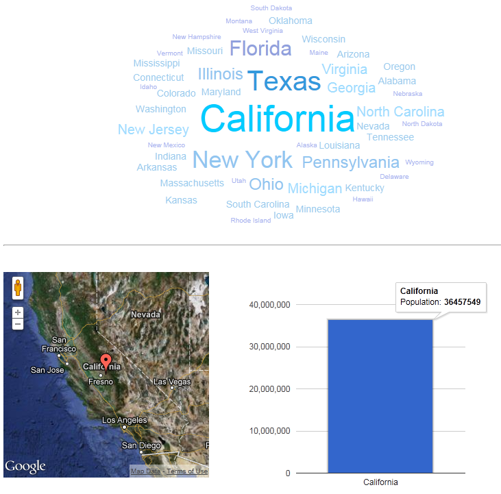
The following example uses a DataTable to populate a Tag Cloud and a Map chart. The tag cloud is interactive, and clicking the state will filter the map and column chart accordingly. Just another example of our html5 data visualization capabilities… Click the image to open the example in a new window.

Posted in BI At Large, Data visualization, HTML5 | Tagged | Comments Off on Tag Cloud and Charts Integration

Visualizing Black Bears Population in NH White Mountains

Last week, i went camping with my family in the white mountains area of New Hampshire. It was a great experience. On the last day of our trip, i learned that the region is home to some 4500 black bears.
Well, once home, I immediately began thinking about visualizing something related to our trip, and the black bears came to mind..
The White Mountains area is about 3400-3600 square miles in diameter. With a 4500 black bear population, it means there are likely a bear or two on each square mile on average. Of course, the reality is much more complex, and things like terrain, and human activity certainly effect the bears distribution, but for simplicity sake, i created a 6X6 grid with 36 squares, each representing one square mile. Then, i draw one, two or none bears in each cell. Finally, I added you as a point of reference to how far you might be from black bears when camping, and layered the whole thing on a nice image of the area. The result is below. You can click the visualization to move the population around. Just another example of how far our html5 dashboarding technology can be stretched to visualize any kind of information.. Of course, this works great on any device, except when on camp, where there’s probably no cell service.. 🙂

Click visualization to shuffle population:

Posted in BI At Large, HTML5 | Tagged , , , | Comments Off on Visualizing Black Bears Population in NH White Mountains

Visualizing Business Velocity

The definition of velocity as distance over time, can be translated in the business world into revenue over time. When looking to measure and visualize the business velocity, or speed, we can use a couple of approaches: actually displaying motion that indicate the speed, as a visualization, or displaying the distance covered (revenue gained) over the amount of time (say months). The visualization below allows you to use both approaches in a fun interactive way.
First, you can pick the velocity for each of the business unites (as measured by revenue per month). When you click the Run button, the speed selected will dictate the speed of the rising bars, visualizing the amount of time it would take each division to hit it’s $1M target.
You can also switch to the timeline display type to change the columns axis to be months, and display how long it would take each department to hit its target (shorter bar are good in this case).
All of this of course is html5 and will work just as beautifully on any browser and device… Enjoy.

Posted in Data visualization, HTML5 | Comments Off on Visualizing Business Velocity

Our HTML 5 Dashboards are here

Our HTML 5 Dashboard solution (BOGOBoards) is here.

Checkout the vid below or click here for the live demo. Feel free to contact me for more info, or go to www.cleartelligence.com for additional info and corporate contact info.

Posted in BusinessObjects 4.0, HTML5 | Tagged , , , | Comments Off on Our HTML 5 Dashboards are here